Interior Curtains


Although I love today's open floor plans sometimes they beg for just a little intimacy.

I also love how steel windows and doors connect an interior to the outside garden and flood the interiors with natural light. It would ruin the simplicity of the window to add curtain panels...

Solution: Add a floating interior curtain!

It's one of those details I have noticed a lot lately that I just adore.


I included two views of this kitchen designed by Beth Webb Interiors because I personally love to see the stylist's touch.


Pam Pierce's famous Houston home appeared once again in Veranda Magazine this month. I love seeing how Pierce has reinvented her beautiful home. Notice the sheer linen curtain that so elegantly floats next to that old beam. It's a chic solution for privacy and for screening away a working kitchen.


Here's older view from Vernada with a different perspective of Pierce's kitchen. A burlap curtain is hiding on the right hand side of the image.


I first noticed interior curtains in some of my favorite rooms from architect Bobby McAlpine. His interiors have inspired me to rethink the way we live.


I also love the interiors from John Saladino. His work is full of inspiring details including the use of interior curtains. In this dining room, the curtains are not exactly "interior" curtains as they do flank the large stone bay window but I thought this particular image best illustrated his unique style of curtain. I love the way it is tied to the wrought iron curtain rod.


And don't think an interior curtain has to be old-world to feature an interior curtain. Here Lindsey Bond of Birmingham uses an interior curtain to close off her office shelving. They are beautifully styled right now with no need to hide away but I can imagine if it were my own office the day would come.


And here, Lindsey Bond uses an interior curtain to give some definition between the living and dining spaces...clever! It also brings softness to a modern interior.

What do you think of interior curtains?


Photobucket
You have read this article with the title February 2013. You can bookmark this page URL https://enjoywithluh.blogspot.com/2013/02/interior-curtains.html. Thanks!

Details I love: Antique Shutters


The next detail I am exploring as I search for charming ways to update my 1970's mountain house is the addition of antique shutters to the pantry in the kitchen. 

As I explained in my last post here, the bones of the kitchen will stay the same - the cabinetry, the black appliances and the basic floor plan and layout. I will be adding hardwood floors, a plank ceiling with old beams, recessed lighting and new pantry doors and shelving. I am also planning to paint the cabinets a soft gray similar to the picture above.

Can you see it?


{Mountain House Project, Before: Pantry Doors}

I am always very shy about showing before pictures especially when I don't have the after pictures to give you that eureka moment...but here is a picture of the bi-fold pantry doors that we will be replacing with old shutters. My fabulous sister is en route to Atlanta as we speak, on her way to the Scott Show, with measurements in hand! I am dying with anticipation!


We are also planning to add new shelving to the pantry's interior. It currently has old wire shelving. The new look will have modern, clean lines with a wide, flat stile like the image above and rolling baskets for paper towels and basics.


Photobucket
You have read this article antiques / Design is in the Details / interior shutters / the pantry with the title February 2013. You can bookmark this page URL https://enjoywithluh.blogspot.com/2013/02/details-i-love-antique-shutters.html. Thanks!
Details I love...


My husband and I are in the process of renovating a house in the mountains that was built and decorated in the late 1970's...let your imagination paint the picture!

I will post before and after pictures at a later date but for right now I am decision mode trying to add details that will give my home character and charm. Much of the bones of the home will stay the same - the floors, the cabinetry, the floor plan - which leaves us with an exciting challenge to use paint and creative ideas to add charisma. 

I have put together a series of posts that will highlight some of the things that I like and am trying to incorporate into the design. Have I mentioned how much I love Pinterest? It is making my job as weekend decorator a whole lot easier!

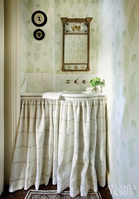
The first detail I would like to highlight is a skirted counter. I love the softness and cottage charm it brings into rooms that typically do not have soft furnishings. We plan to skirt a little section of the kitchen counter to hide the recycling and also plan to update the master bath cabinetry. We are using a neutral Belgian linen similar to the first image in the kitchen and a brown ticking stripe in the bath.

I am still searching for a source for the small diameter brass rail and rings...anybody?


{Heather Chadduck - favorite from the old Cottage Living}


Photobucket
You have read this article Design is in the Details with the title February 2013. You can bookmark this page URL https://enjoywithluh.blogspot.com/2013/02/details-i-love.html. Thanks!

Design is in the Details...


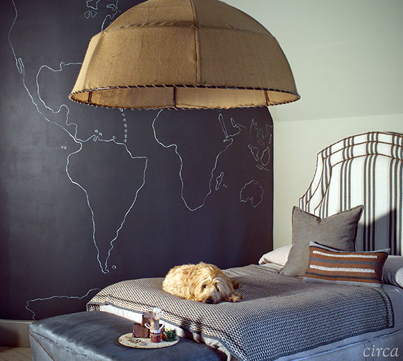
{Circa Interiors, Designer/Owner, Cindy Smith}

When I was first married in Charlotte, my husband and I bought an old cottage that we lovingly restored all by ourselves. I have such fond memories of sanding floors, hanging wallpaper and making curtains. We painted the hardwood floors in a little hallway between the bedrooms and mixed custom paint colors that most would have thought at the time were strange.

I know you are thinking..."What on earth does this little story have to do with these gorgeous interiors from Circa Interiors?"

When I was all of 26 years old, I went on the Mint Museum's Tour of Homes and had the delight of touring Cindy Smith's home, owner of Circa Interiors. I'll tell you a little secret - shhh! - I purchased another tour ticket that year so I could go back through Cindy's home a second time and take note of all the special details!

I toured her home at a time in my life when I was formulating my own personal sense of style, busy creating a home and making it mine. To this day, I am fascinated by the unique details and warm, inviting interiors that come from not only Cindy but the other talented designers that call Circa home.

These gorgeous new photographs are from Circa's newly designed website that showcases the portfolios of Circa's designers. 

And there's good news for all of us obsessed with a good design book...

Jane Schwab and Cindy Smith, owners of Circa Interiors have a new book coming out in March,

THE WELCOMING HOME: The Art of Living Graciously


Click over to Circa's new website and get a sneak peek inside the book!


Here are just a few of my favorite rooms...don't miss all the special details!

{Circa Interiors - Designer/Owner, Jane Schwab}


{Circa Interiors, Designer Heather Smith}

{Circa Interiors, Designer Heather Smith}

{Circa Interiors, Designer Patrick Lewis}

{Circa Interiors, Designer Kathy Smith}

{Circa Interiors, Designer Catherine Walters}

{Circa Interiors, Designer Heather Smith}

Photobucket
You have read this article Circa Interiors with the title February 2013. You can bookmark this page URL https://enjoywithluh.blogspot.com/2013/02/design-is-in-details.html. Thanks!