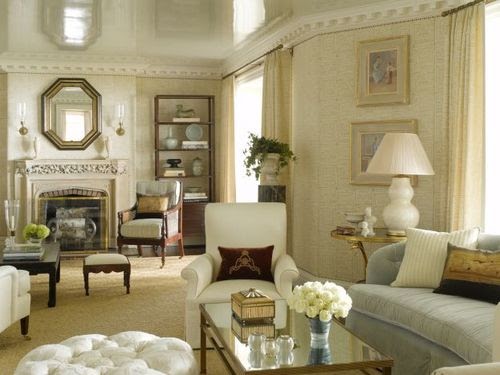
I thought I would share a few photos from my freshly painted living room. I really love the depth of color the new Hardwick White walls and trim bring to my favorite room in my house.
We bought a 1950's ranch some ten years ago and completely gutted the interiror. We took out doors and opened up the rooms and now each room.flows into the other. The living room is at the heart of my home and sets the tone for the other rooms. This is both a blessing and a curse as when you redocrate and paint one room, the others must soon follow. Especially, recently with my latest endeavor to paint. I am fortunate to have 6 inch plaster mouldings in the living room, an architectural detail i adore and a something of a rarity in a 1950's ranch. Of course, I don't actually call my home a ranch. I affectionately call it a cottage, a term of endearment. The challenge came when I attempted to paint the trim in a semi gloss, the same color as the walls. Influenced by my inspirational magazine images and visions from my travels abroad, I am truly working from blurry blueprints.
I should also mention that after my painters left each evening I sat in my dimly lit living room and contemplated my choices. When they arrived the next morning bright eyed and coffee ignited, I welcomed them with open arms and well, a few changes. Let's just say they might not ever call me back. The good news is i think i got it right. The bad news is
Is there ever really a right?
My niece, Caitlin, just started as a new job with Brenner Children's Hospital and is staying with us some during the week and commuting to Charlotte for the weekends. She brought me these beautiful pink tulips...my favorite!
Here's a view back into the entrance hall on the right and to the kitchen and breakfast room on the left. Oh, and I moved the furniture {again}. This English chest used to be between the two front windows. I swapped it with the french buffet des corps and took the doors off the french piece. I can not believe how much I like the new arrangement. I really thought the french piece would be way too rectangular between the two big windows. I was wrong! The transformation is amazing. the living room feels much larger and full of light. Removing the doors and accessorizing the interior makes the piece not so boxy and brings a curiosity cabinet aesthetic to the room.
The pair of angels on my coffee table are from the Christmas collection from Pottery Barn. I can't bring myself to put them away. They were on my mantle at Christmas and have been floating around the room over the last few months.
Before the painters came, I collected everything from the room and piled it in my dining room...all the pictures from the walls, all the porcelains stashed in the cabinets and drawers, all the coffee table books, an odd assortment of gilded and crusty antique frames...well, you get the picture. As you can tell, I am a collector. Since I was itty-bitty, I have loved to collect things. It started with things from nature...rocks and seashells, sharks teeth, leaves, and driftwood. Then as a teenager, I tagged along with my Dad to the local Charlotte flea market, now, Metrolina Expo. It wasn't very sophisticated in those early days.
In recent years I have slowly been putting away many of the things I have collected. It seemed everything was going greige and creamware and painted furniture and Swedish. I loved the look but how did I fit in with that new look? Realistically, I couldn't just start over. I also needed to consider my family and how we live in our house. I mean my husband really loves that old world, dark, rich interior. It is lived in and personal and warm. And then there's my best friend, Sadie. How does a big, furry Labrador retriever fit into an all white, curated home.
This brings me to my living room. I have to admit that I liked the way the living room looked in my new Greige paint color with the floors covered in painter's drop cloths and the furniture draped in white. It was serene and peaceful.
After the painter's left and uncloaked my living room, I moved the furniture and swapped the chest and the French piece. The doors were still off of the French piece and I admired it and its openness. I started to bring back my collectibles, grouping them as the experts suggest. I stacked my interior design books beside a chair and made an end table. I kept the things that i really love..the Pottery Barn Christmas angels, my seashells and coral, my English ironstone porcelains, my coffee table books, my quirky collection of old frames, my mismatched furniture and pillows and added the flowers from my niece.
The result is me.
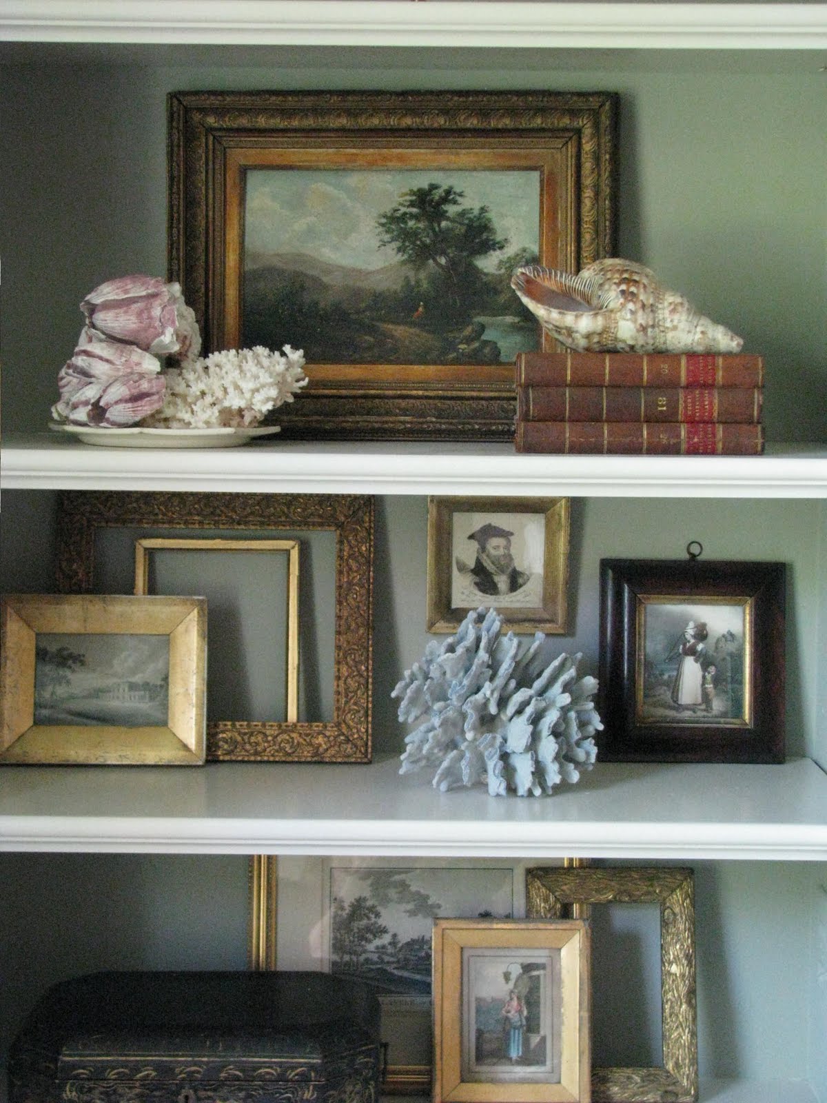
My parents gave me the oil painting in the bookcase for my 40th birthday. It used to hang in the dining room of their home. I had always admired it and for my 40th they surprised me with a modestly wrapped gift that turned out to be this loevly little painting. I teasure it becuase of this special memory of our family celebrating my milestone birthday. The funny thing is my daughter thought this was terrible...that my parents would take something off of their own wall that they treasured and give it to me. Now, that my next milestone birthday looks at me square between the crosshairs, I seek to create interiors that reflect who I am, who we are, where we have been and the things that have brought us joy along the way.

The little framed prints came from my first trip to London when I was just out of college. They are from an antique stall in the Bermondsey Market. I think that was the start of my addiction to frame collecting. The stall owner would take antique frames and the gilded inner fillet and cut them down and frame interesting old portraits and prints. They were not expensive...my memory is fading, but I want to say they were 10 to 15 pounds each. The backs were often finished with duck tape.
Many years later i found an old pastoral painting at a flea market. It was unframed. I liked its humbleness without a frame but everytime i visited an antique market, I searched for the perfect frame only to buy another unframed painting. And so on and so forth...another old frame, another old unframed painting. As I layered in all of my favorite things into my Living Room, I once again could appreciate the beauty of these old frames and let them stand alone. I stacked the rest of my collection on my dining room mantle. I love the result and will share a photo with you as I tackle updating my dining room.
I really like that new term floating around the blogsphere
UnDecorate
To me, it says be confident in who you are and gives you the license to make a very personal statement through the interiors in your home.
"Perhaps now is the time to undecorate, and by that I mean it's time to embrace the new design trend of undecorating. In her book, "Undecorate: The No-Rules Approach to Interior Design," Christiane Lemieux, the founder of the innovative fabric and furniture company DwellStudio, documents a widespread new trend in interior design, which is to say the lack of it, or rather the profusion of do-it-yourself style: "Perfection," she writes, "is overrated." The ideal the book puts forth is of unfussy, lived-in, creative, imperfect homes; it's a postcard taped to a vanity mirror, or two children scootering across a loft's exquisite floorboards, or cheap blue vases from Chinatown wired into lamps. The premise here is cleverness over money, taste over expense, personality over hired expertise, idiosyncrasy over polish; it's a welcome development, reflective of a recession-fueled revelation that money is not the same as beauty."